Saucony: Run As One
2025
Design SystemCampaign
Founded in 1898, Saucony is one of the world’s premier running brands. With a stable of both classic designs as well as cutting-edge performance shoes, the brand found itself with two distinct wings of its business, with different visual guidelines for each. Saucony brought me in as a design consultant to help unify these two sides of the brand under one holistic visual identity. Working with their internal team, I helped them identify and develop practical solutions to clarify and elevate their existing brand system.
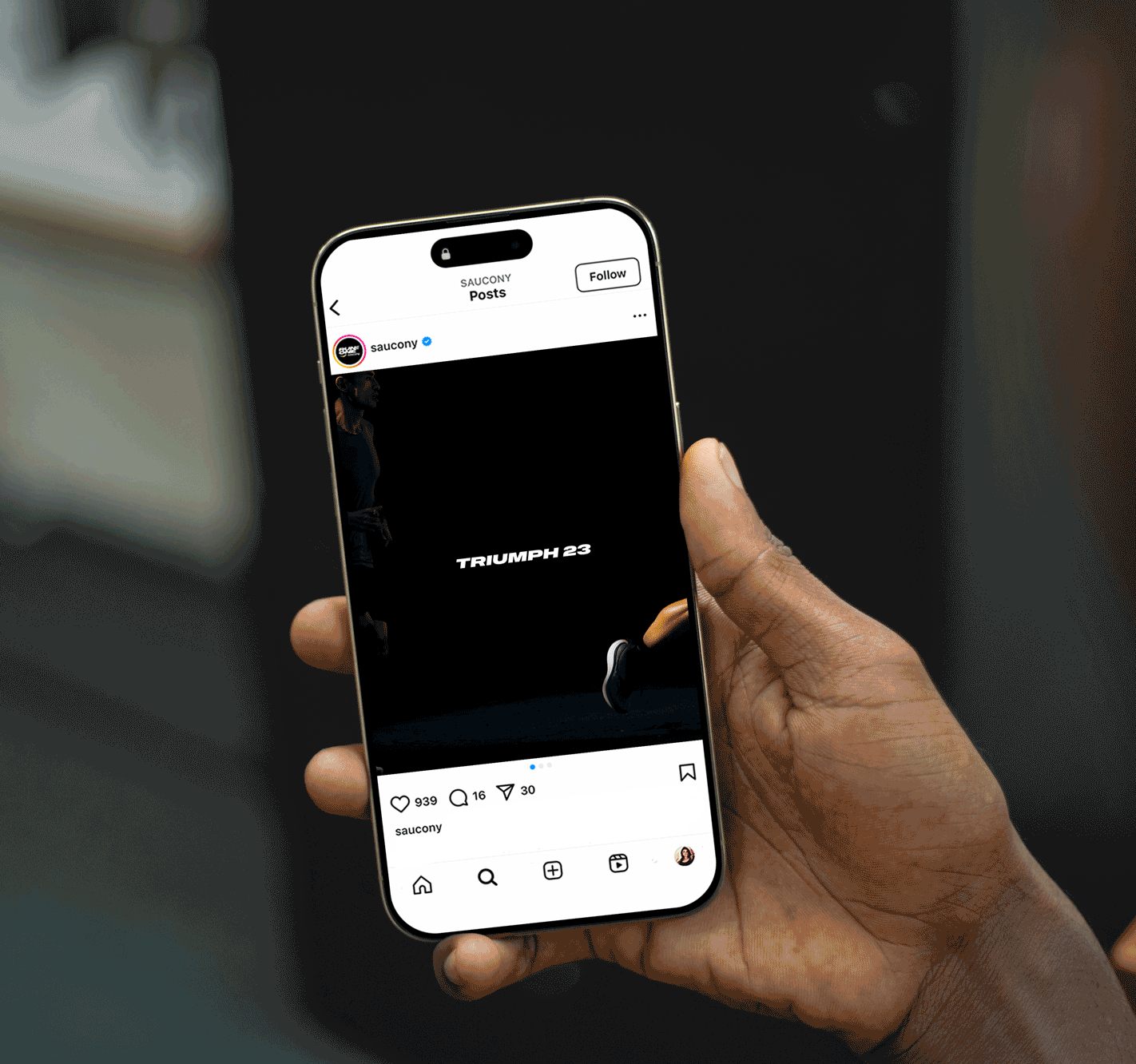
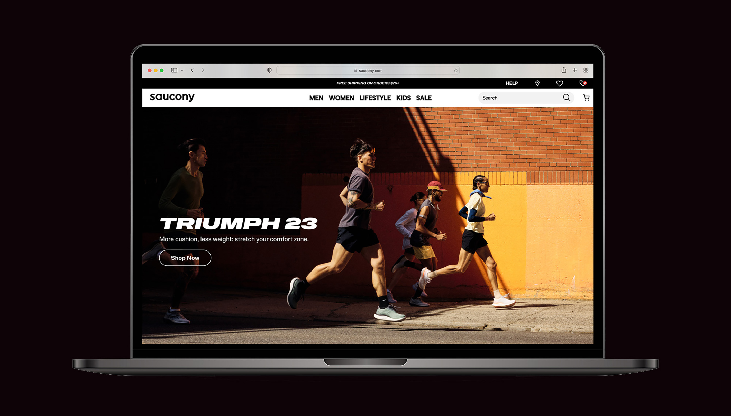
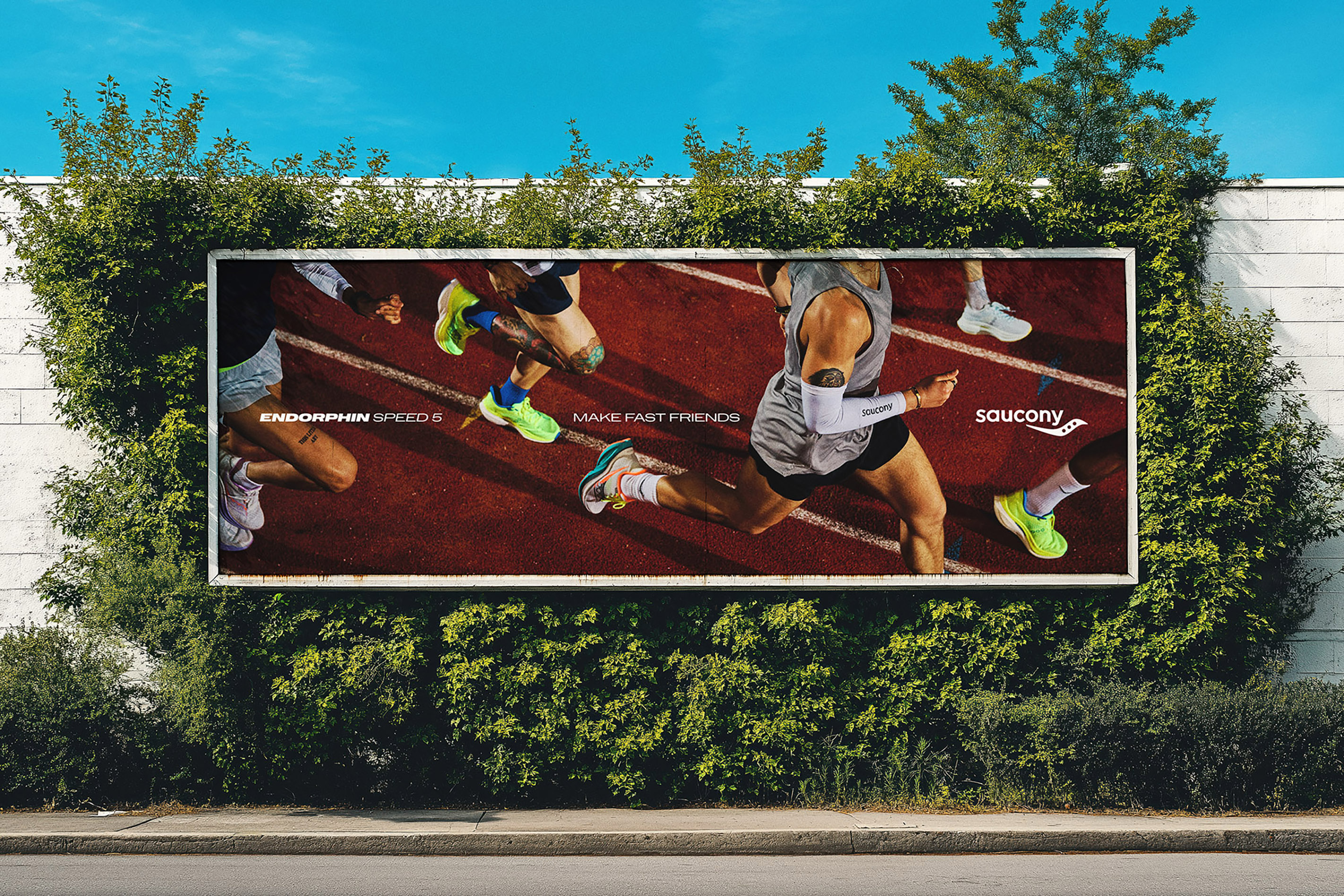
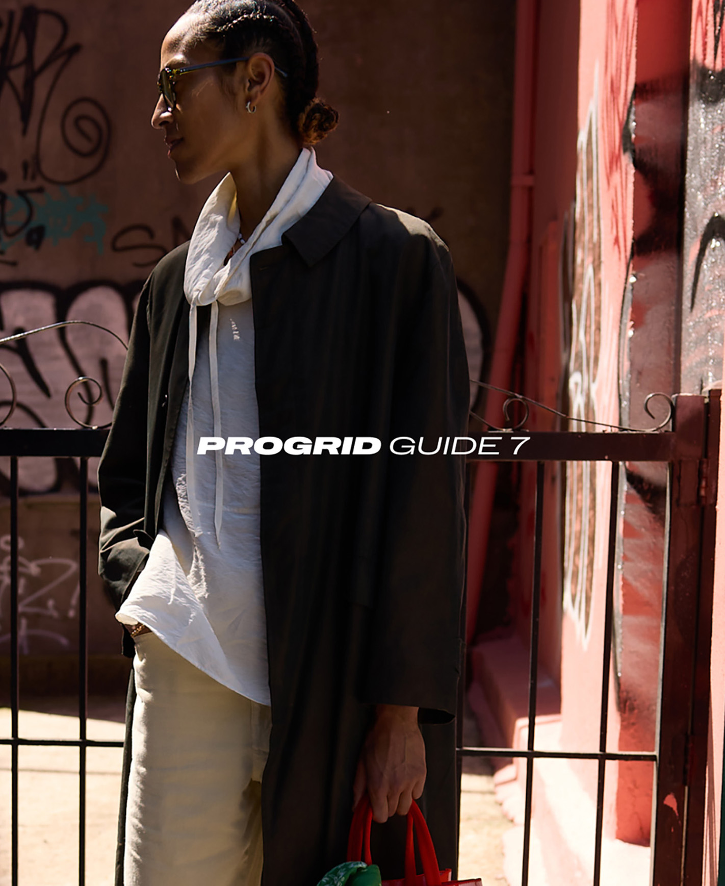
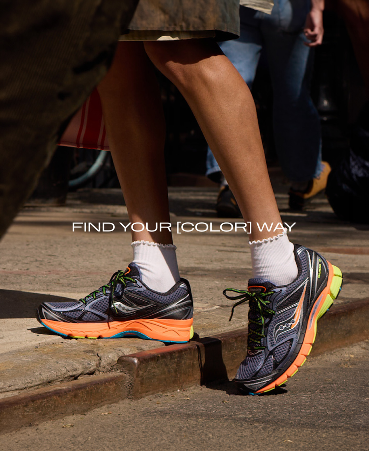
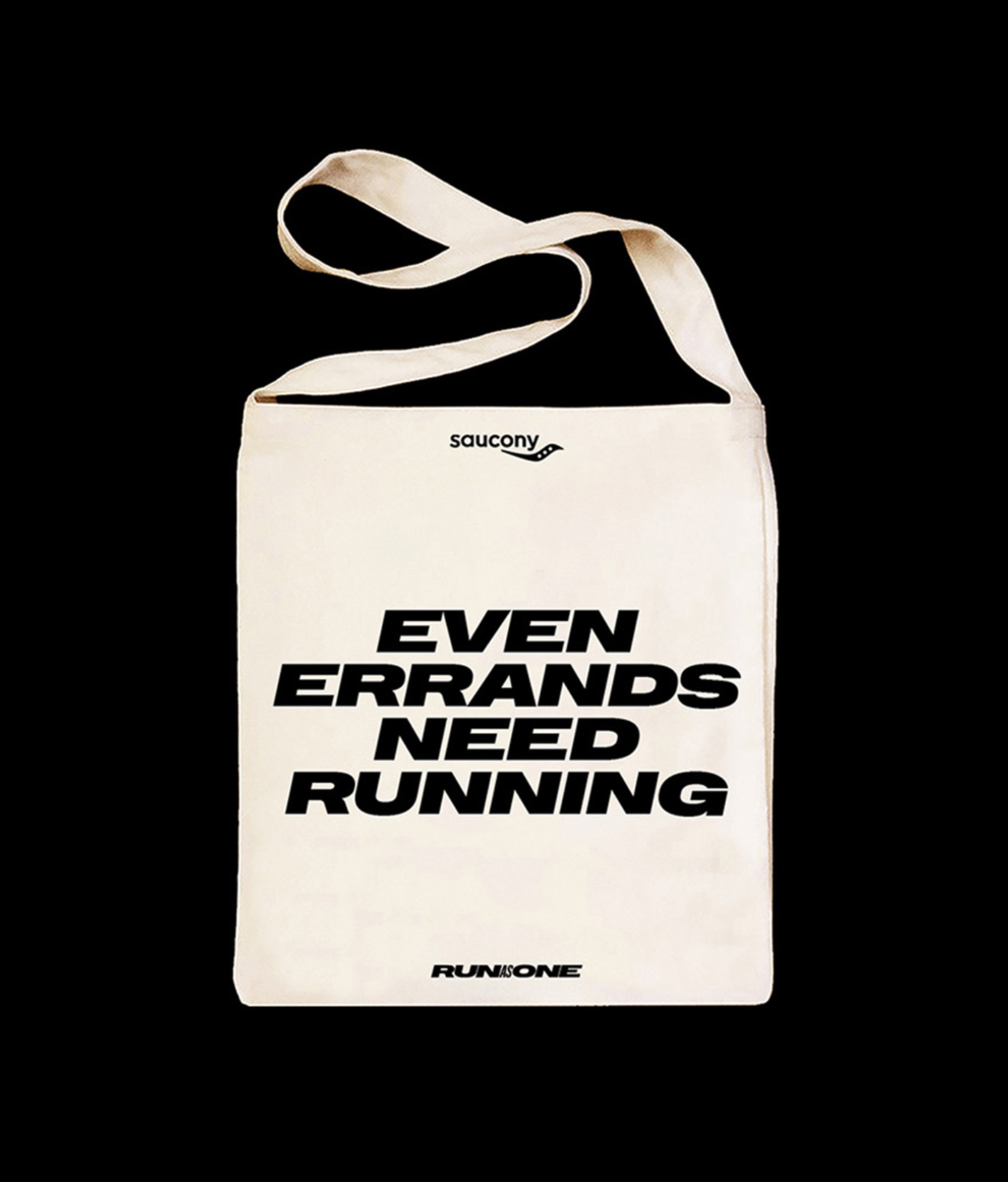
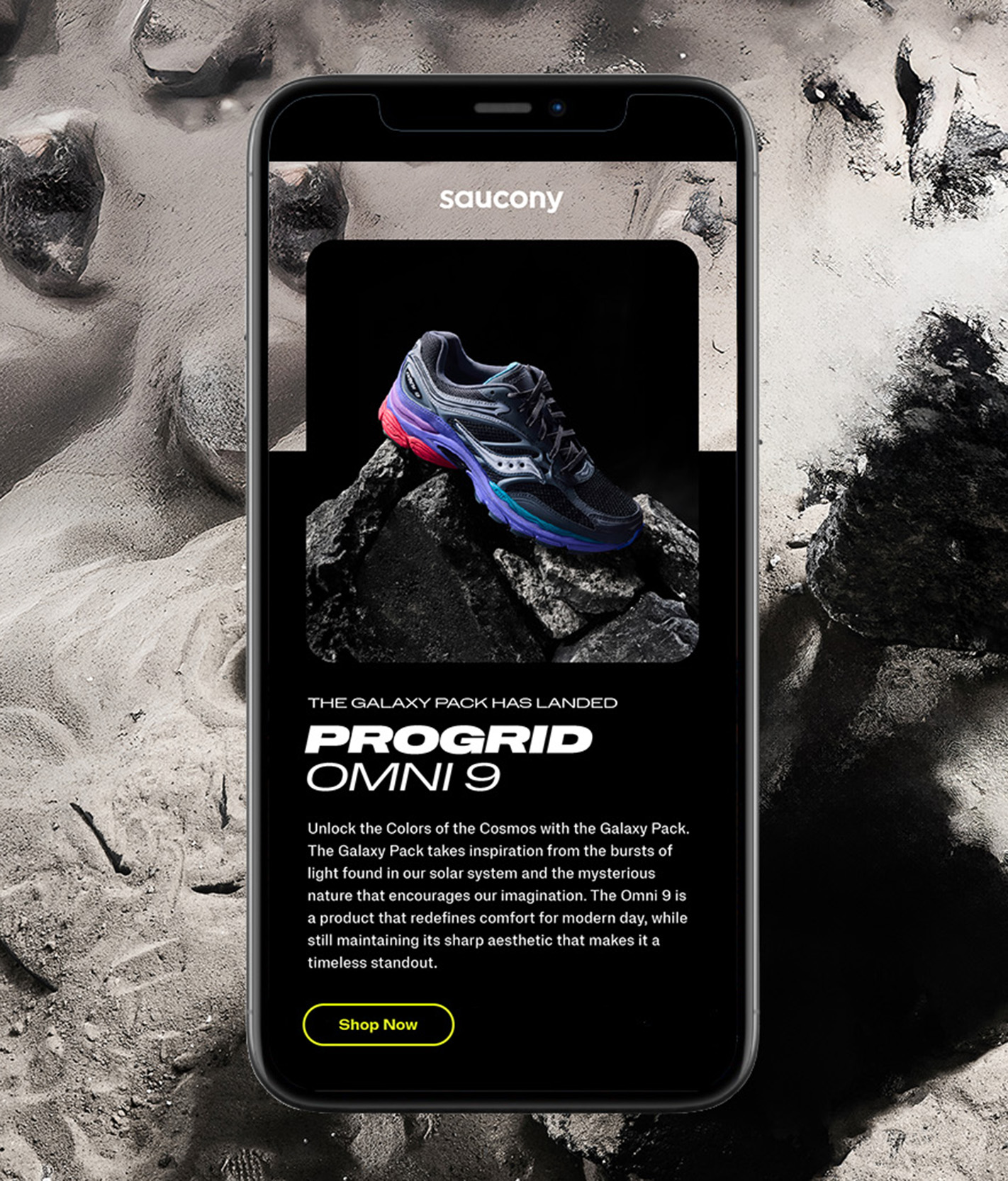
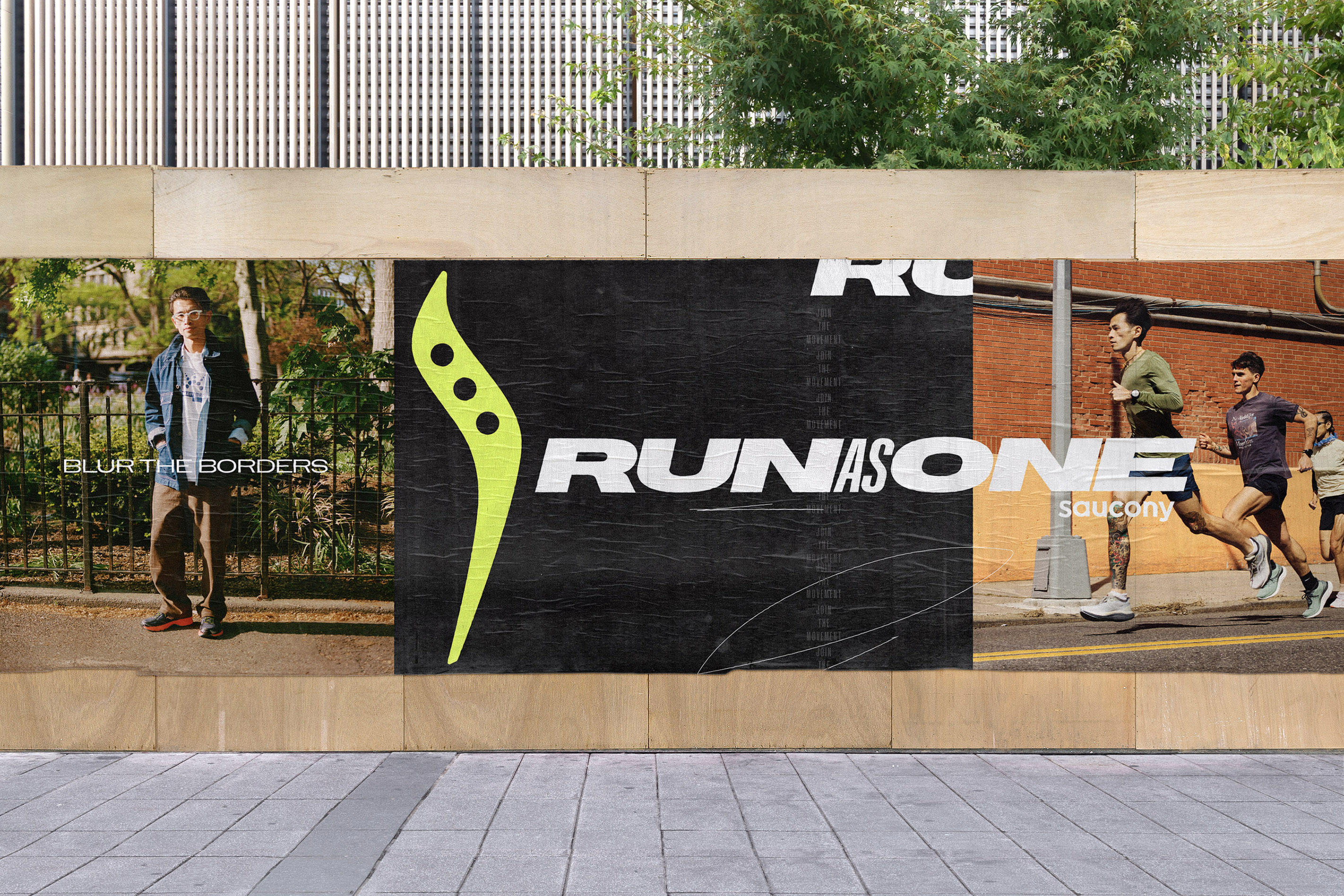
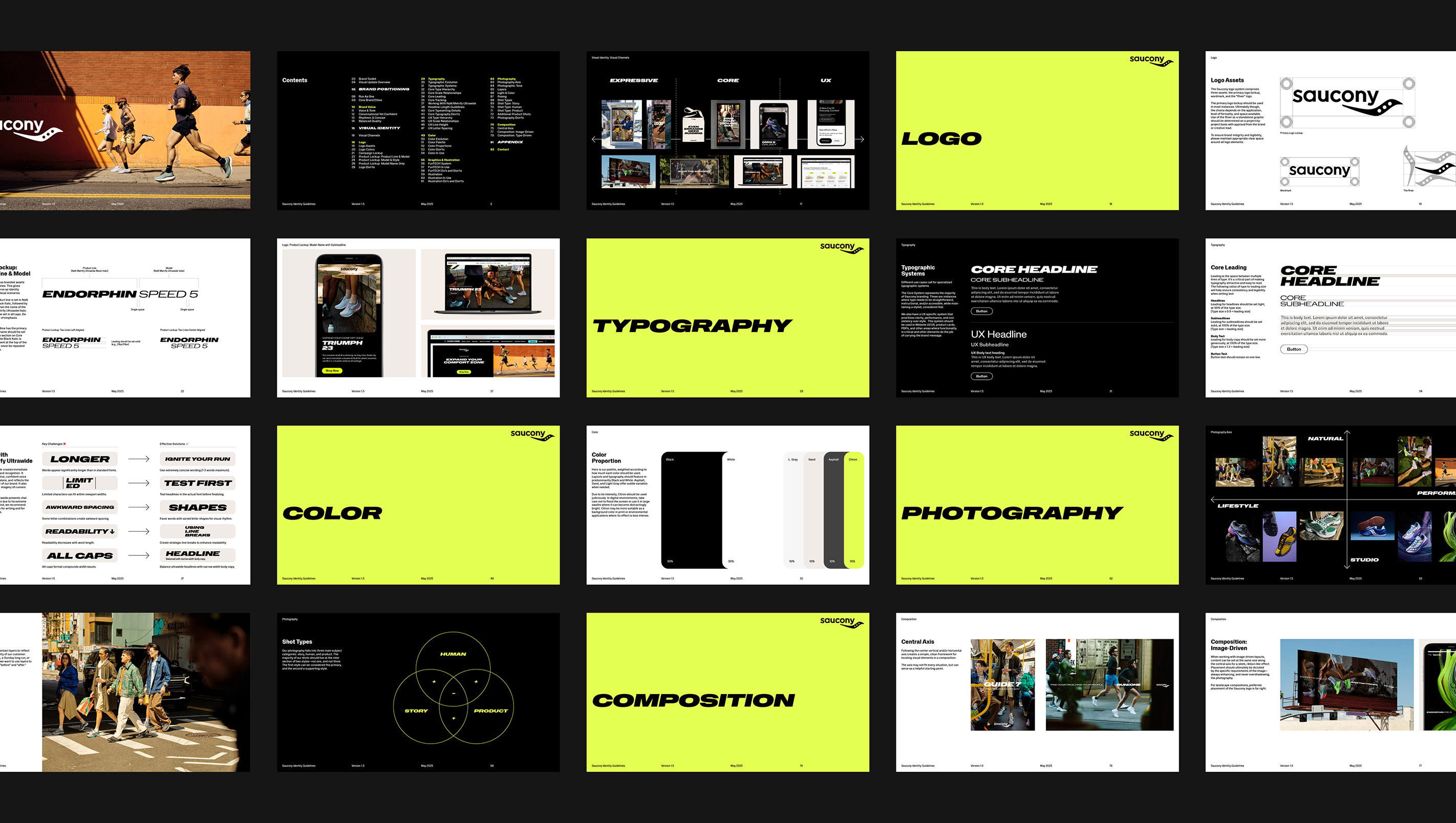
As the separate sides of Saucony’s business grew, it developed different typographic styles for its performance and lifestyle products. We united the brand under one typographic system, driven by NaN Metrify Ultrawide Black Italic as Saucony’s attention-grabbing headline font. We took advantage of Metrify’s range of widths and weights to build out a comprehensive system that can handle a range of brand needs, from bold out-of-home billboards to function-forward UX assets.
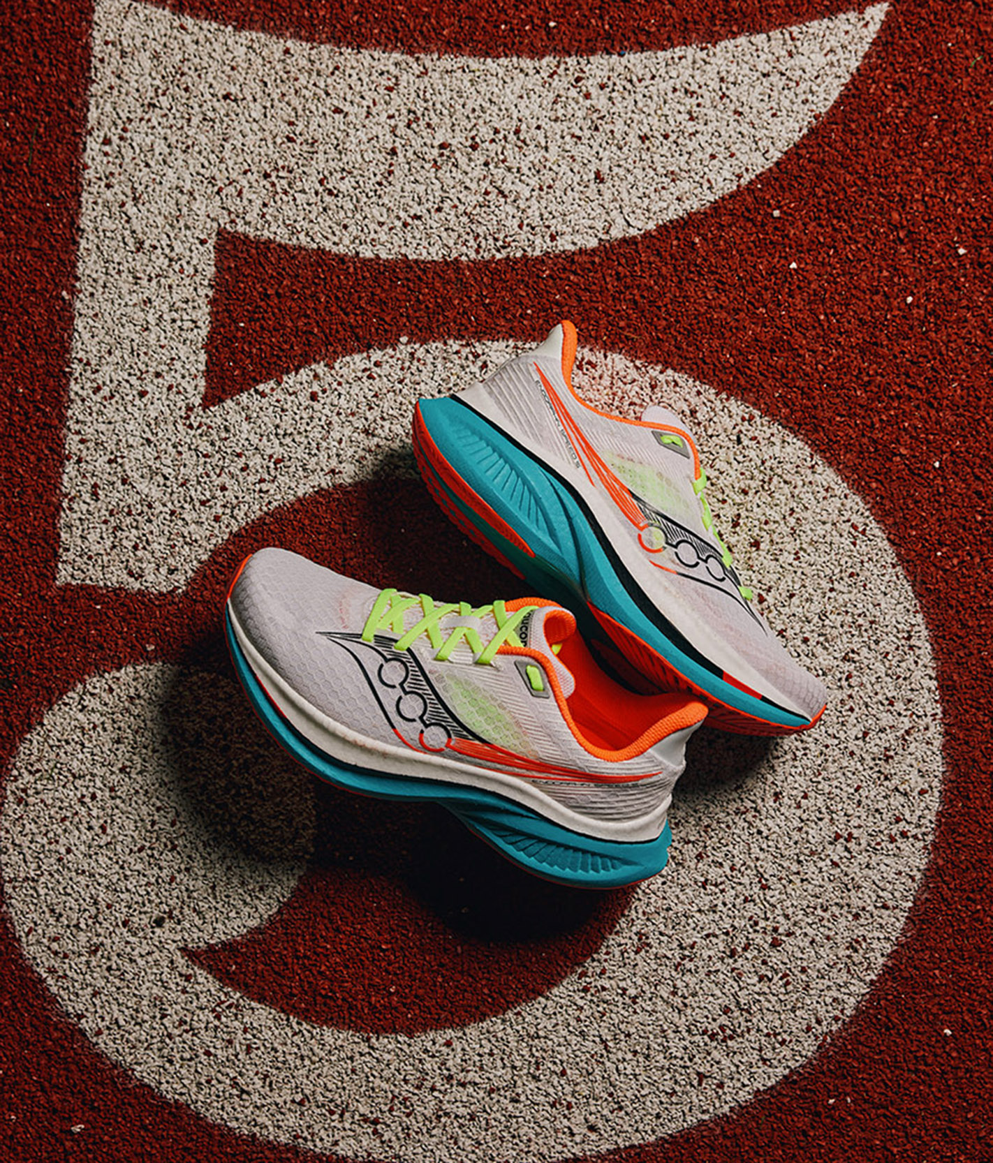
We also developed a more nuanced color palette that’s unique within the competitive landscape. Black and white communicate Saucony’s premium performance and style while neutral tones Asphalt, Sand, and Light Gray bring tonal warmth and versatility. Citron is a vibrant accent color that exemplifies speed and passion. Used strategically, it brings energy to the brand across executions and product lines.
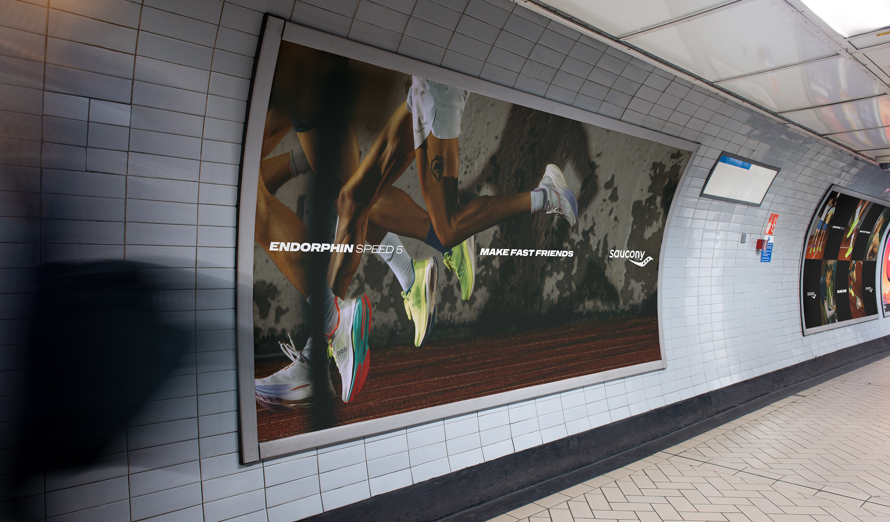
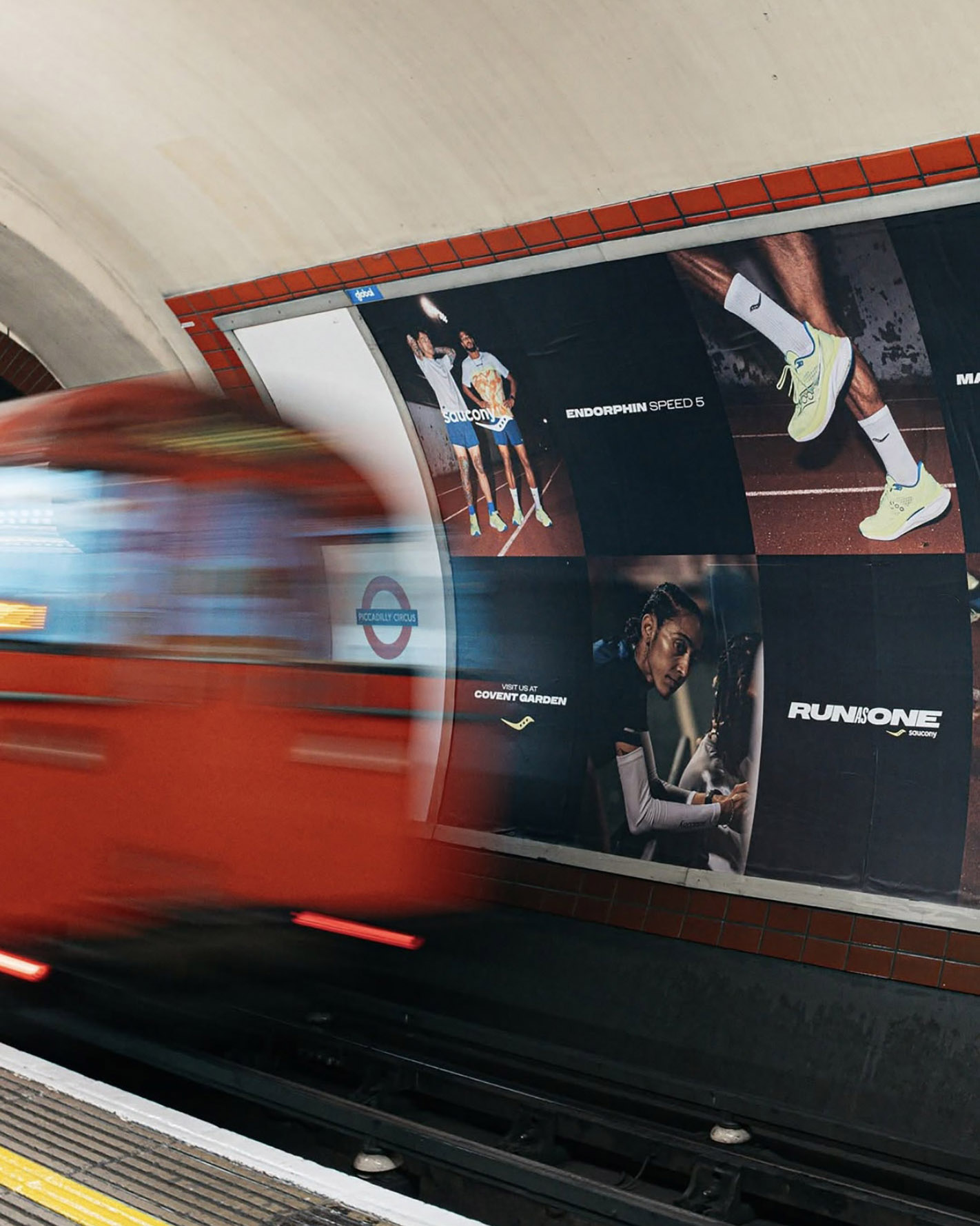
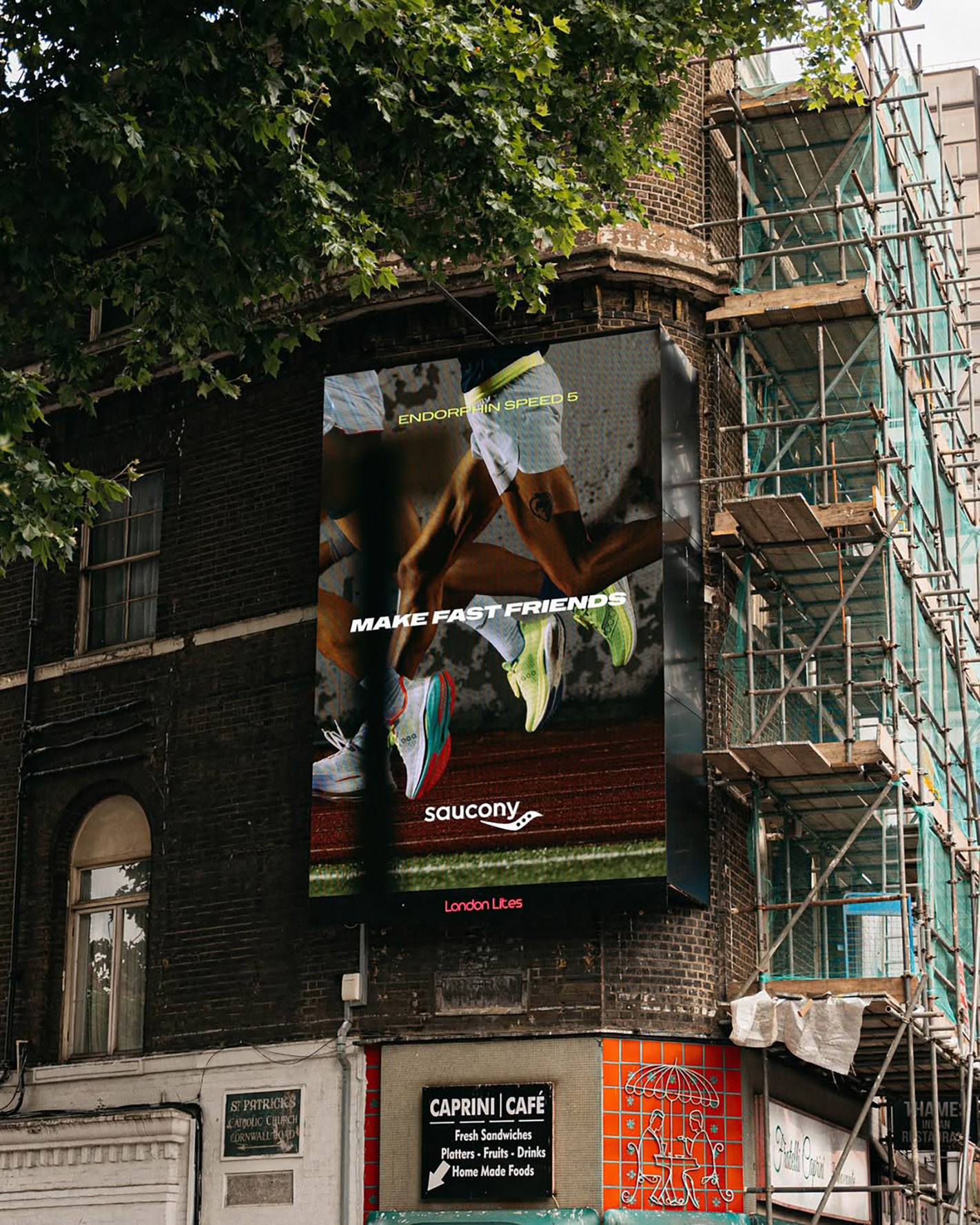
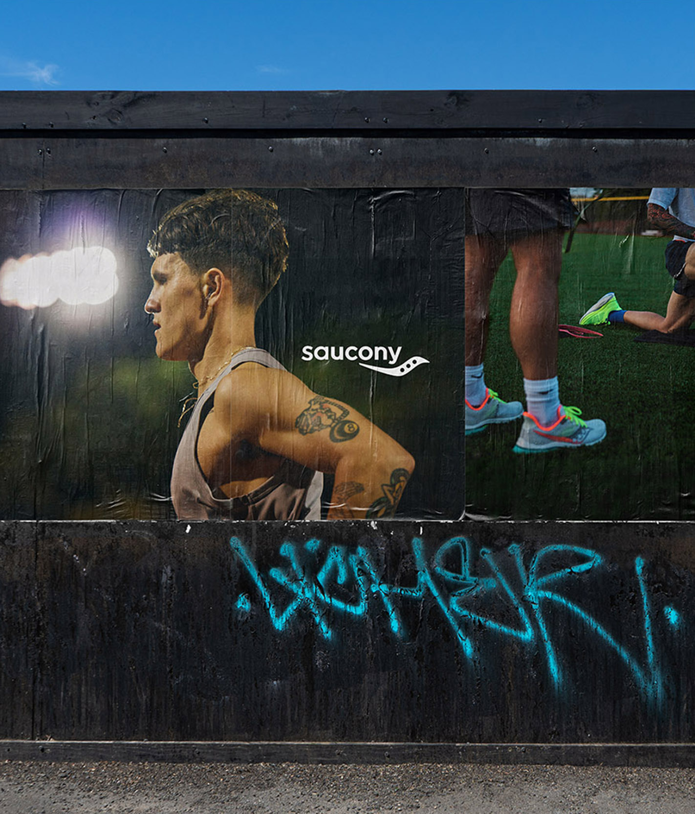
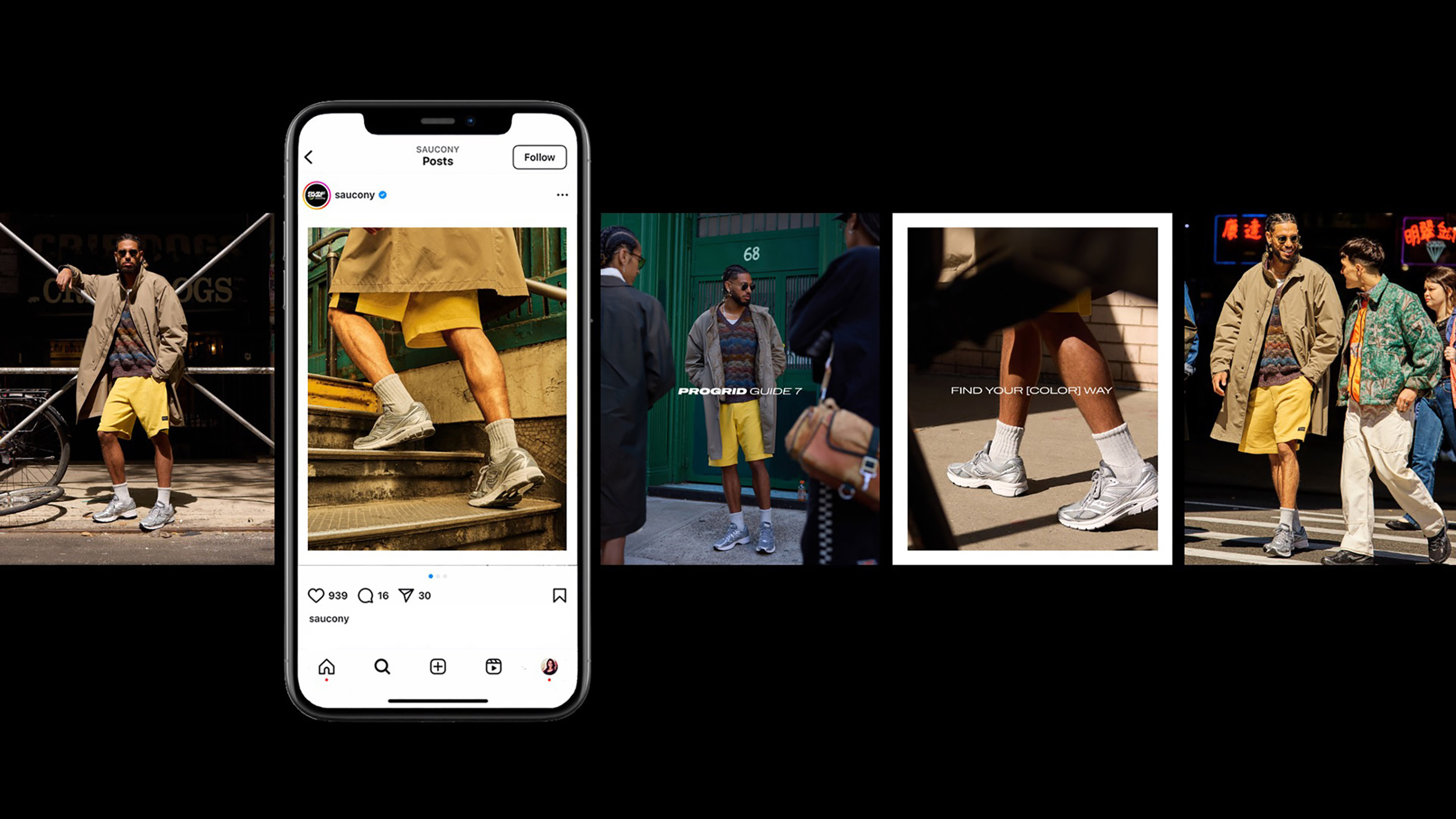
Saucony’s updated brand embraces the act of blurring the borders. It’s both performance-driven and lifestyle-oriented, with a voice that’s conversational yet confident, and photography that's expressive, timeless, and intimate. Layered compositions nest typography along the center axis of images, always enhancing and never overshadowing the strides of its subjects. It’s a visual direction that aims to give customers a peek behind the curtain—to show running as subculture with an open-door policy. The Saucony crew has high standards, but all are welcome.
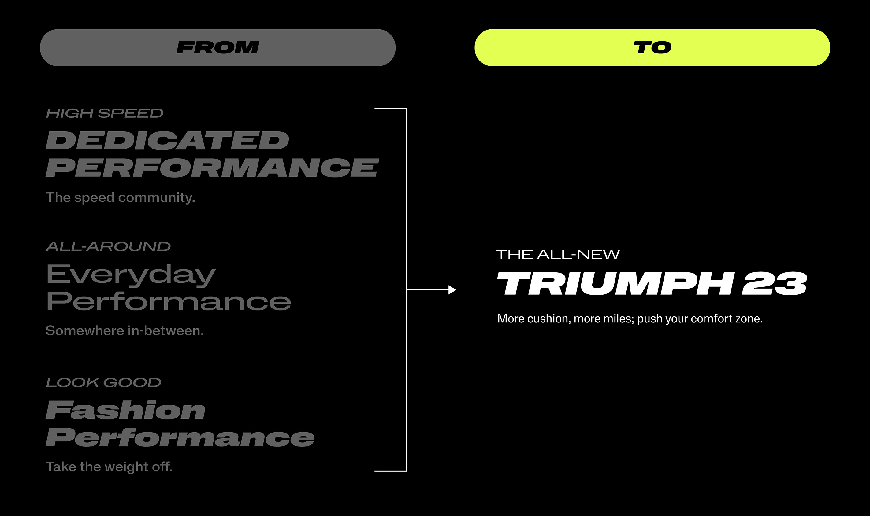
Saucony’s previous typographic system used different styles for performance, everyday, and lifestyle storytelling, which muddled brand voice and led to visual confusion. The updated system brings all categories under one typographic framework, resulting in a brand that’s easier to recognize, easier to use, and more cohesive without losing its edge.

Saucony Global Brand Team
Gus Johnston, Global Creative Director Julia Dann, Senior Brand Designer Josiah Reese, Brand Designer Bret Hawpe, Digital Design Director Katherine Weis, Senior Digital Designer Joshua Sikkenga, Digital Designer Brooks Heintzelman, Design Systems Consultant Patrick Gietzen, Senior Creative Services Manager