ClarityPay
2024
Graphic Identity
ClarityPay provides customizable pay-over-time plans that help merchants convert shoppers into customers. They came to Company Policy as a new company seeking to establish a visual foundation to support their growing brand.
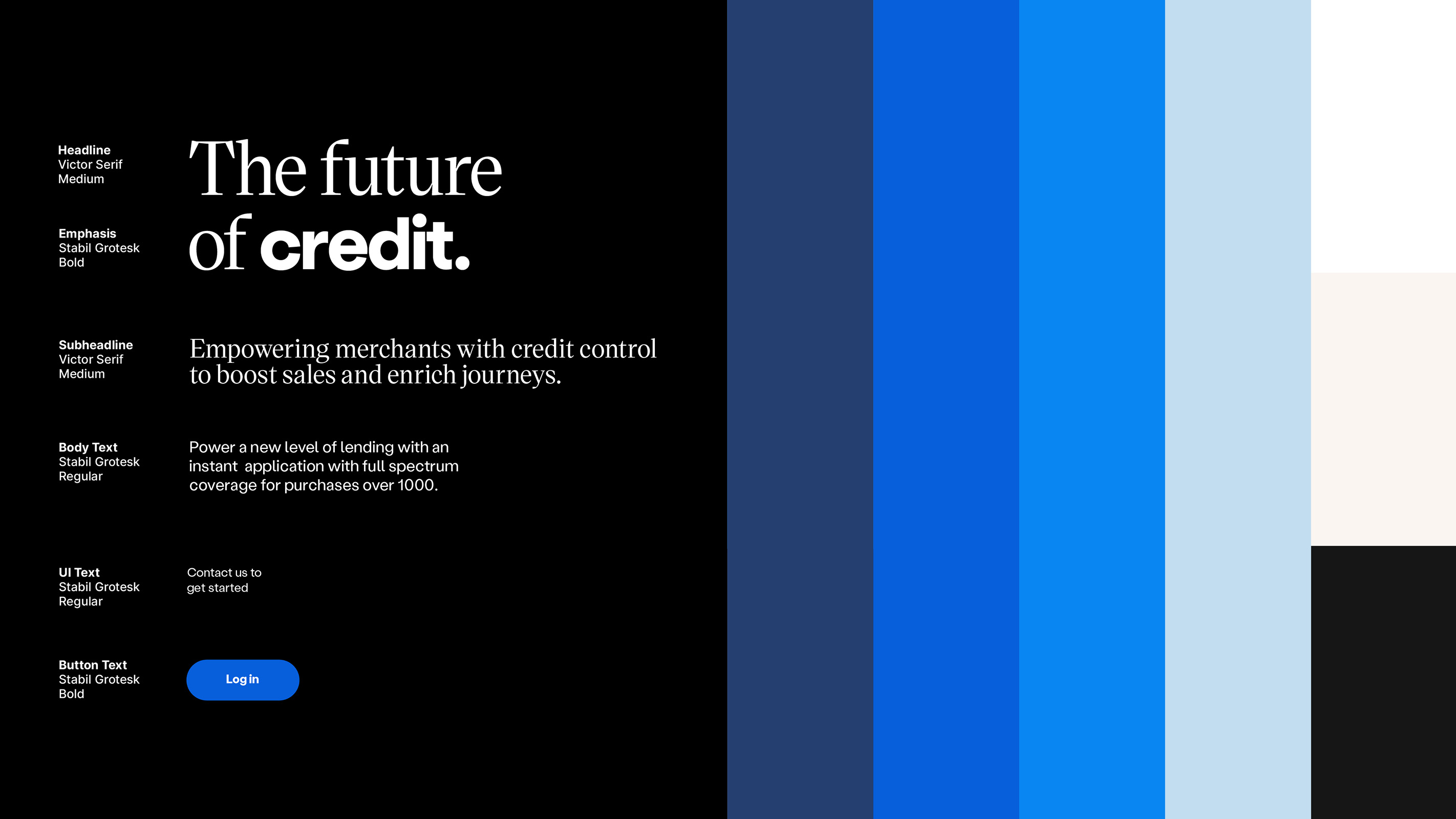
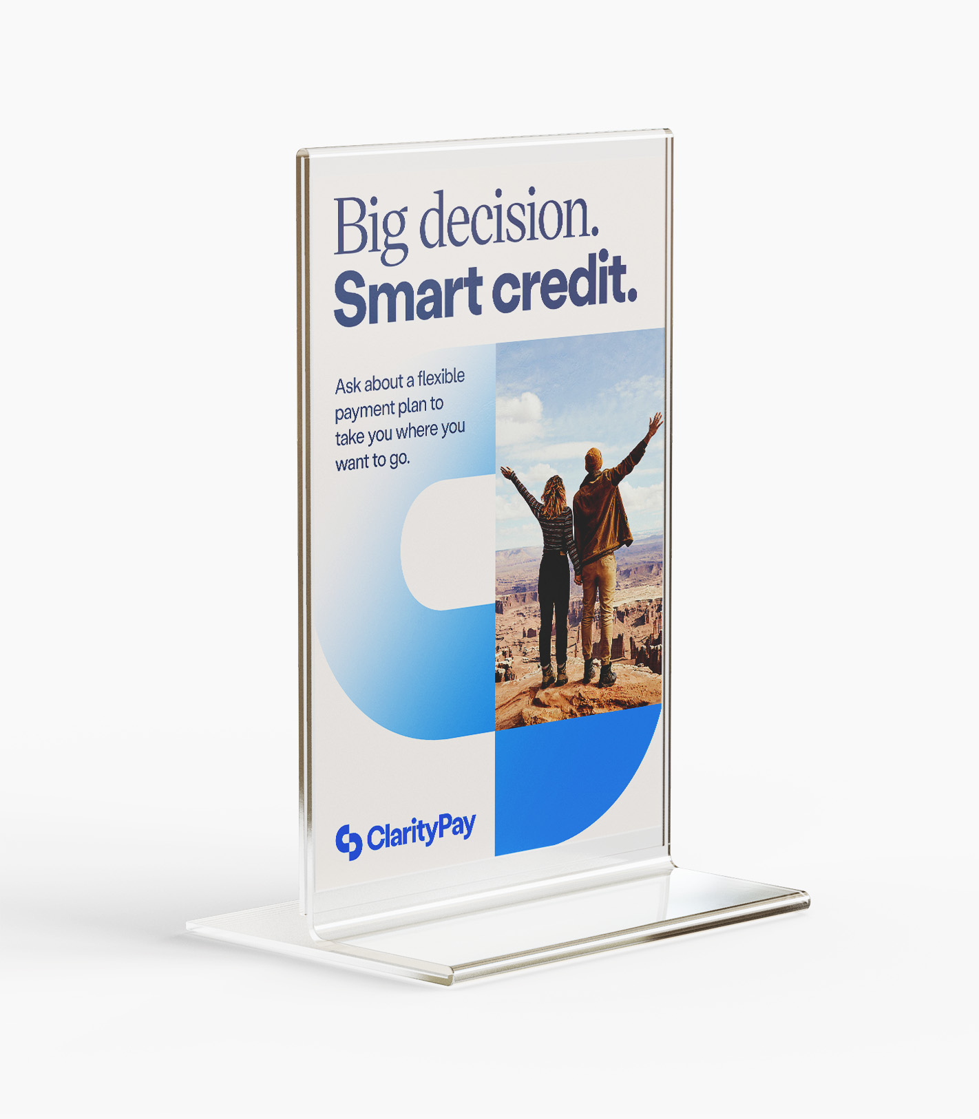
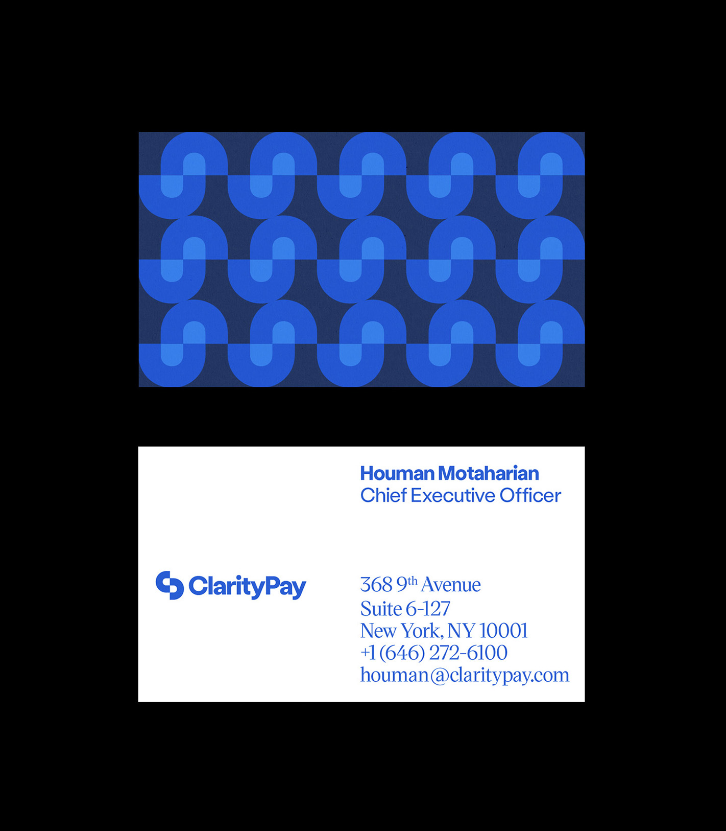
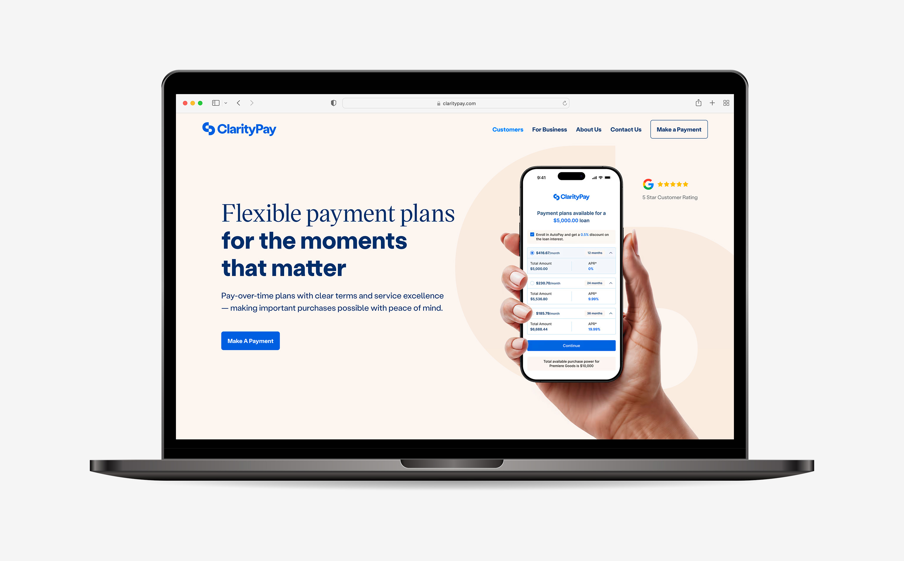
We established a clean, monochromatic palette led by blue as a symbol of clarity, loyalty, and trust. The ClarityPay icon, derived from interlocking “C” and “P” initials, also represents the link between merchants and customers. When used as a repeating element, it builds into wonderfully graphic patterns. A pair of typefaces from Czech foundry KOMETA—sharp-edged Viktor Serif and dependable yet friendly Stabil Grotesk—bring an elegant voice to a financial category too often lacking in style.
ClarityPay has since received additional venture funding and become profitable as a company.


Company Policy
Adam Katz, Creative Director Nicole Banda, Design Operations Brooks Heintzelman, Senior Designer