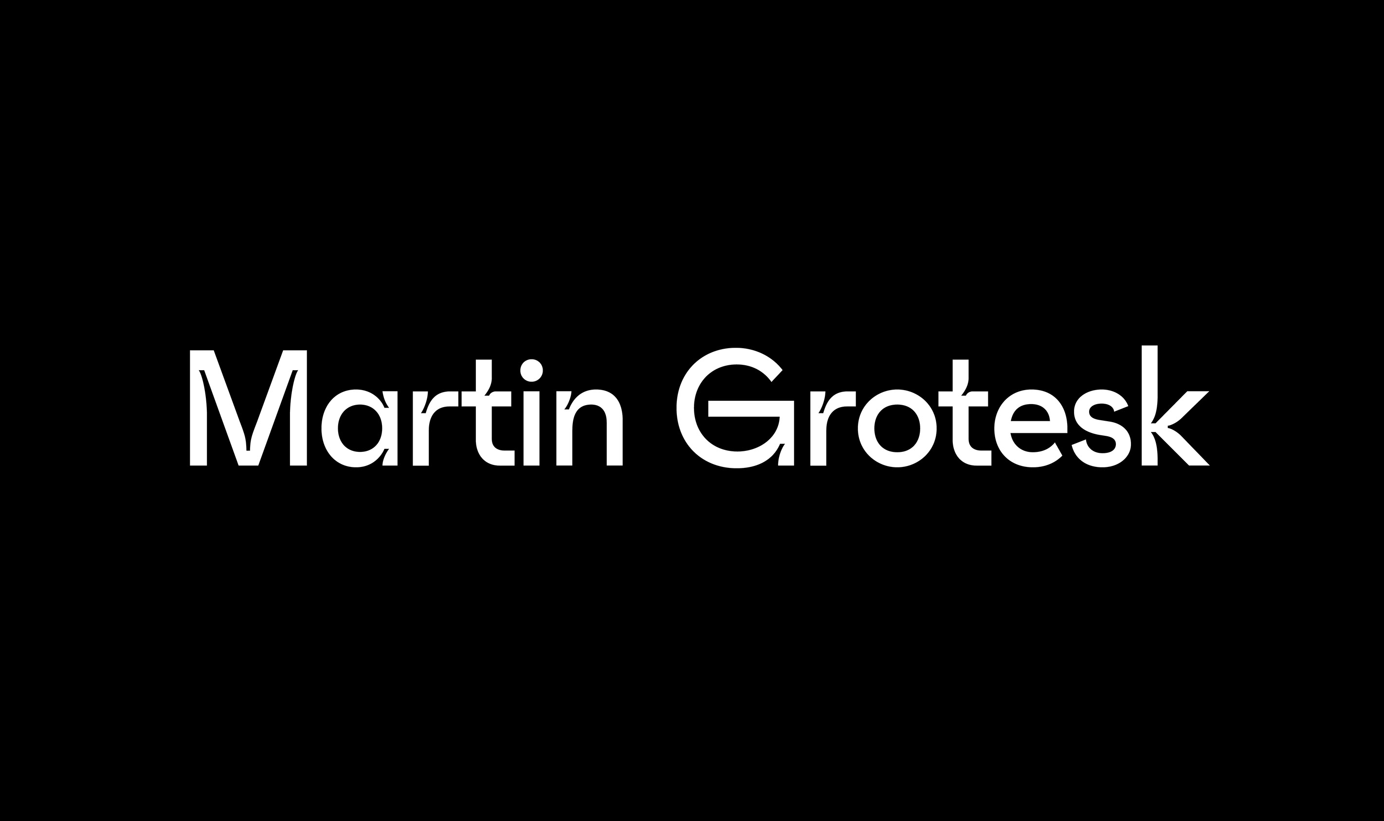
Martin Grotesk
2020–2021
LightRegular
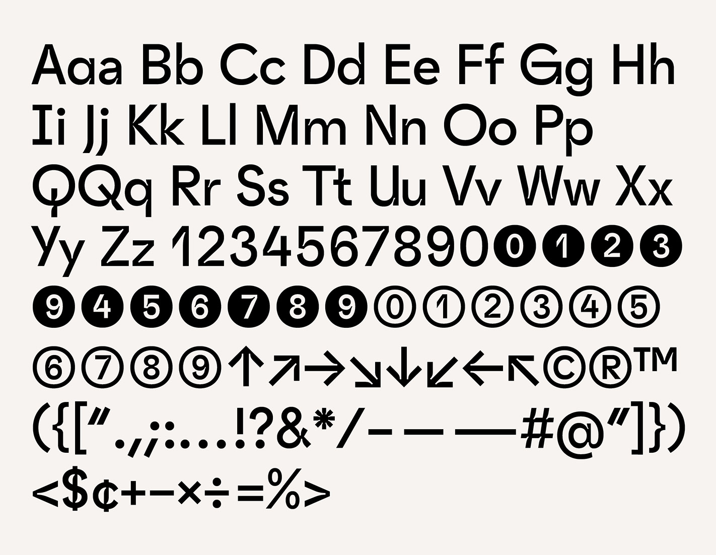
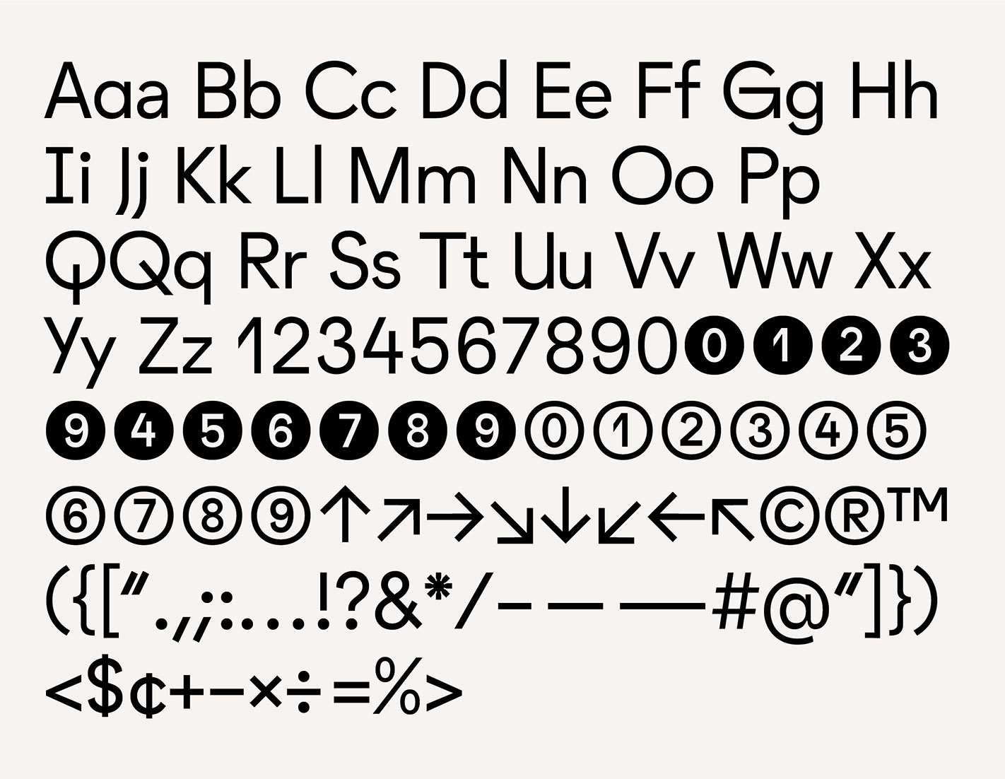
The Martin Agency commissioned me to design a bespoke typeface as part of their 2020 visual identity refresh. Martin Grotesk started as a friendly, geometric sans-serif typeface; the addition of playful, exaggerated ink traps brought some additional intrigue and ownability. While the letterforms work equally well for setting text and headlines, the ink traps become an especially graphic flourish at larger display sizes. I also designed a lighter weight without ink traps for greater typesetting flexibility and visual differentiation.


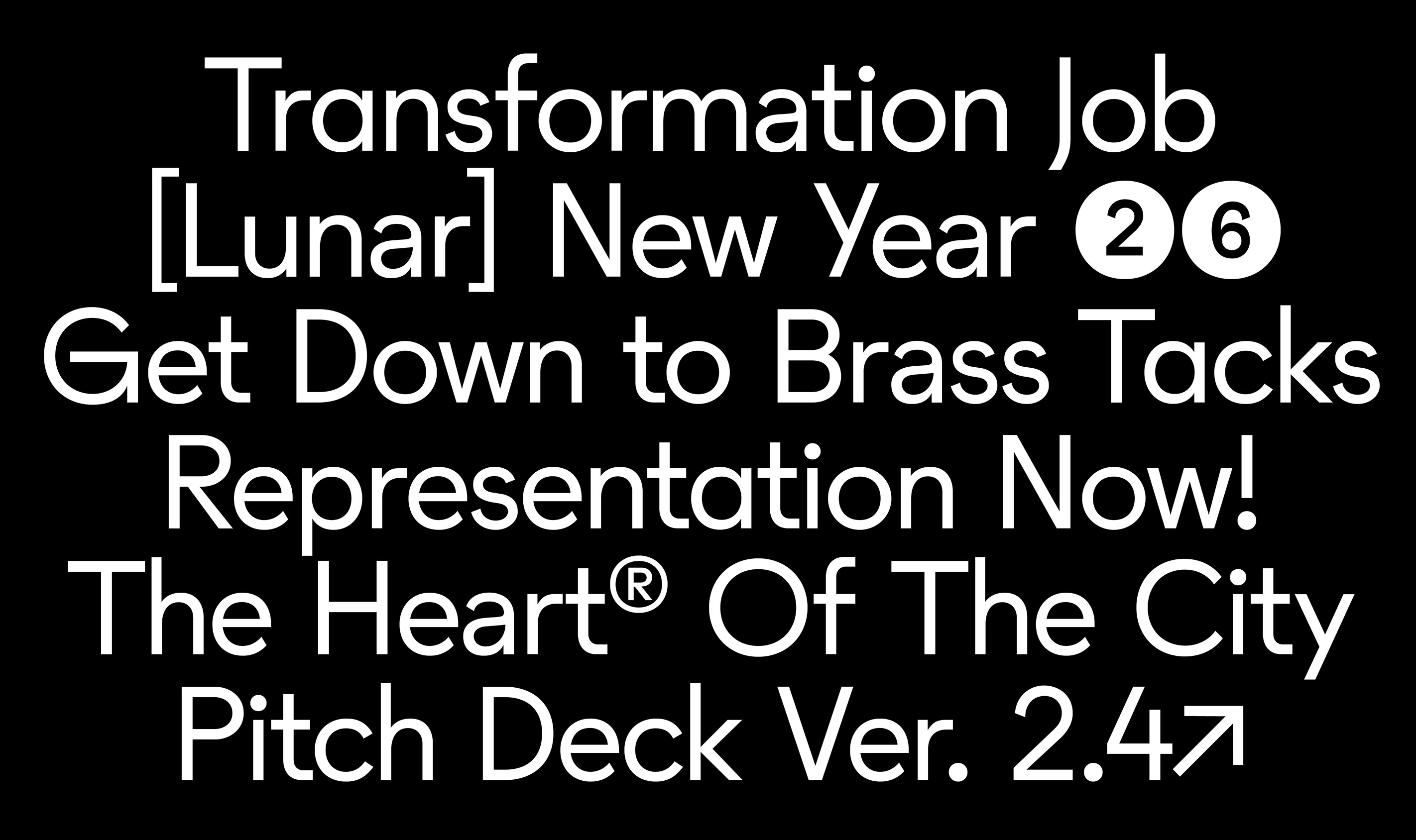
Martin Grotesk Light (with Stylistic Alternates)
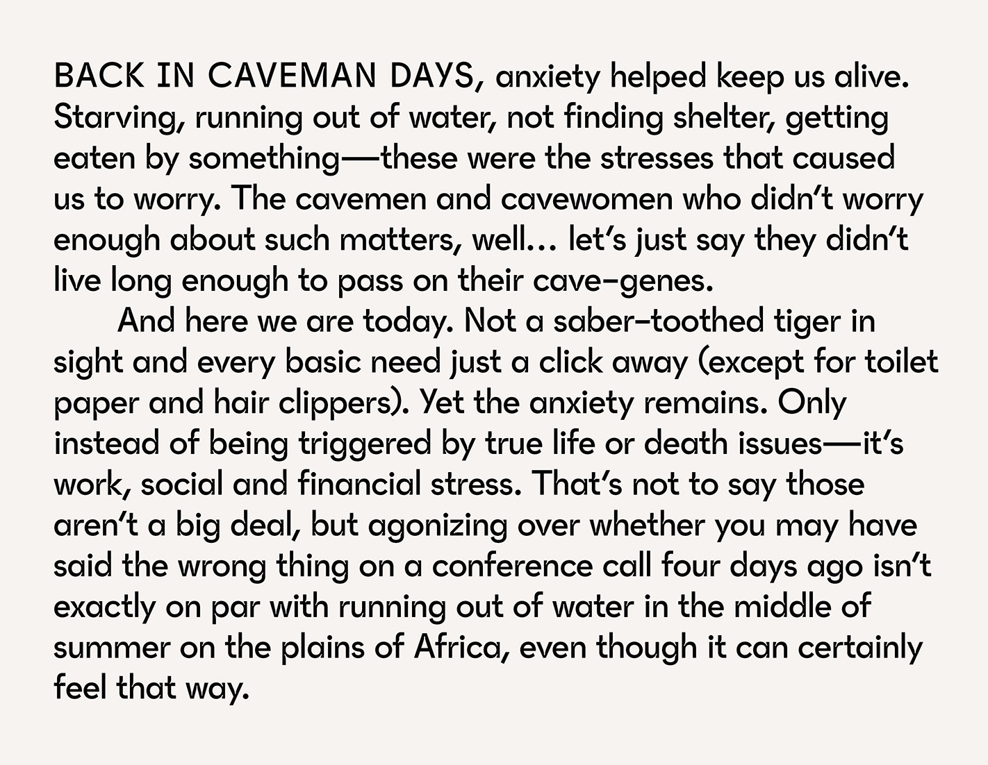
Paragraph: Regular
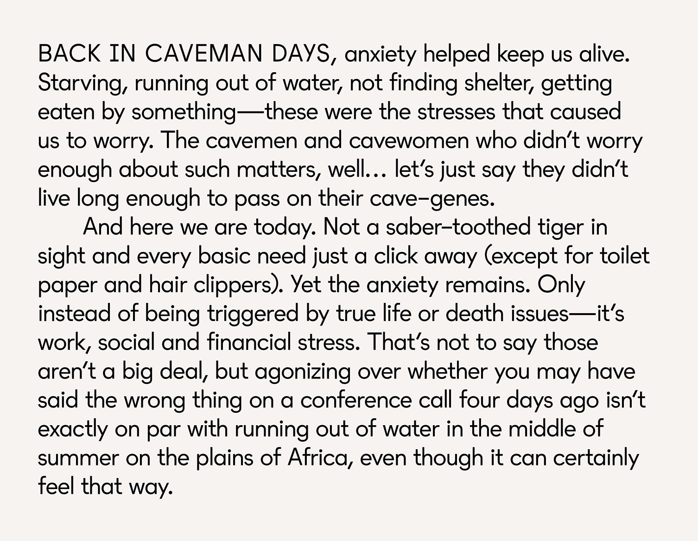
Paragraph: Light
Character Set: Regular
Character Set: Light
In Use
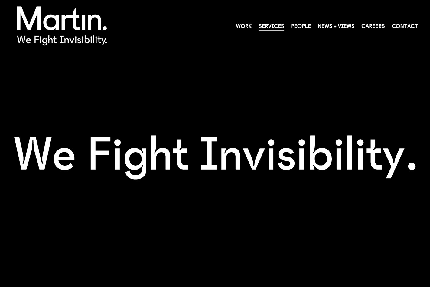
In Use
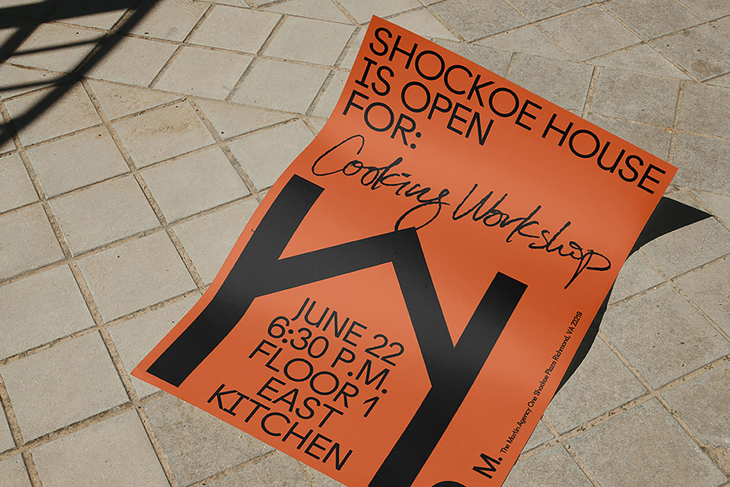
In Use

The Martin Agency
Adriel Nunes, Head of Design Thiago Elias, Design Director Brooks Heintzelman, Type Designer